What is Streamlit?
Streamlit is an open-source Python library for creating interactive data science and machine learning web applications. It is designed to make building data science tools for the web more accessible and faster. It allows users to quickly create beautiful user interfaces for their machine-learning models and data visualisations using only a few lines of code. Streamlit also provides a range of features, such as authentication, data sources, and web deployment.
Prerequisites
Python knowledge.
Working knowledge of Python package managers.
CLI or your favourite IDE. I use VSCode.
How to create your first Streamlit Application
Since Streamlit is a Python library, you can install it using any Python package manager. I will use the Package Installer for Python (PIP) in this tutorial inside a PIPENV environment. Click on the links above to get acquainted with PIP and PIPENV.
Use this excellent guide, Pipenv: Python Dev Workflow for Humans, to set up PIPENV in your machine. Remember to use other package managers like VirtualEnv if you prefer them.
After setting up PIPENV, create your project folder, enter it and open a terminal. You can do this using an IDE or directly on your CLI.
Please run the following commands to create a virtual environment for your project, activate it, and install streamlit and pandas packages.
:> pipenv shell
:> pipenv install streamlit pandas
The commands above will create two files in your project folder: Pipfile and Pipfile.lock; these two are used by PIPENV to maintain a list of installed packages and associated requirements. Create an app.py file in the root of the project folder, i.e., next to the files mentioned above.

Create a folder inside your project folder. Name it "data". Download the following CSV data files and move them to the data folder.
File_1: ea_urban_pop.csv
File_2: kenyan_town_populations.csv
The structure of your project should look as in the image below.

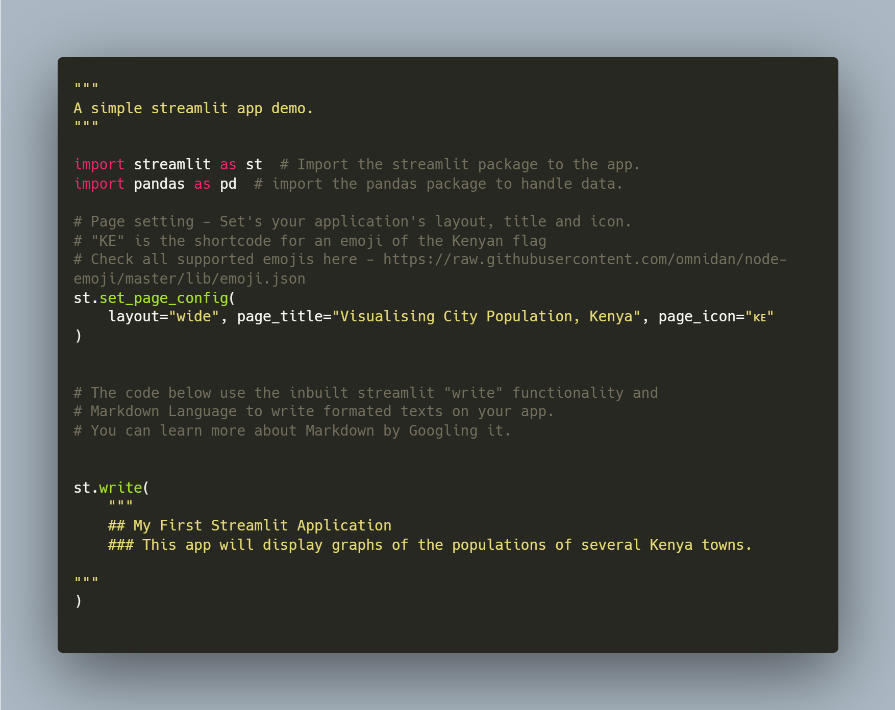
LET'S GO CODDING! - Open your app.py file and enter the code below. I will use comments to explain what every line does. In this step, we will import Streamlit and Pandas and write a few words on the application. Read through the code and use the comments to understand every line.
We can now run the application to the effect of the code above. To run the code, ensure that you are in the correct project directory and that your virtual environment is active, then enter the following command to run the app.
:> streamlit run app.py

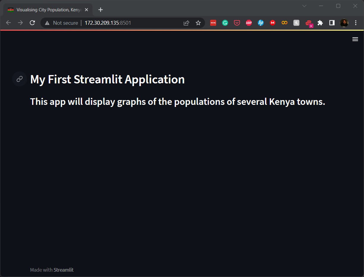
If everything is set up correctly, a Streamlit server will be launched, and links to the app will be displayed, as shown above. Type either link on a browser, and voila, your app will display the textual information we coded in the app.py file. In the image below, you can see:
The wide layout, title and the Kenyan flag emoji.
The heading and subheading of the app.
Simple data visualisation
Let's enrich our app to do a few simple data analyses and then display their visualisations. Read through the code comments to understand what each line of code is doing.
First, we shall read the data on our data file into a pandas data frame as follows:

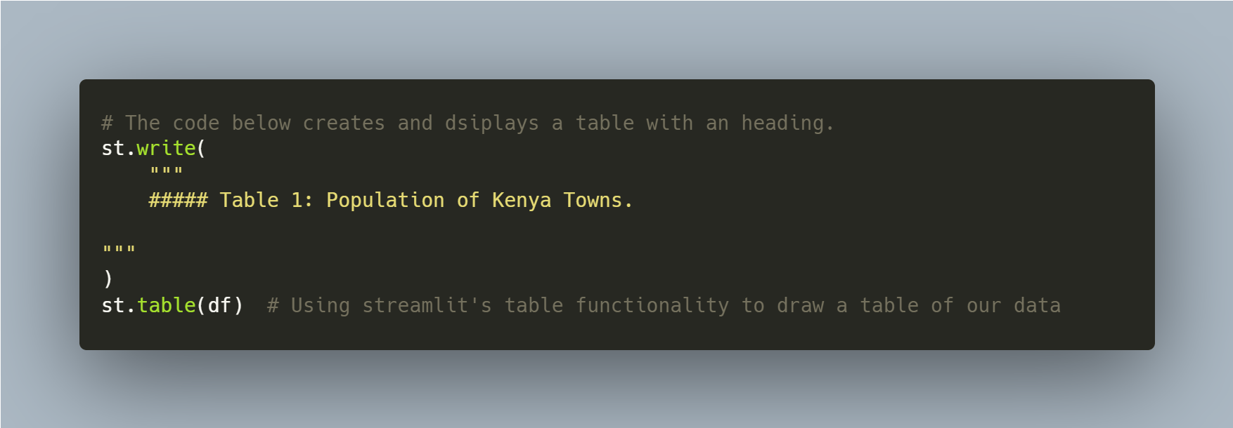
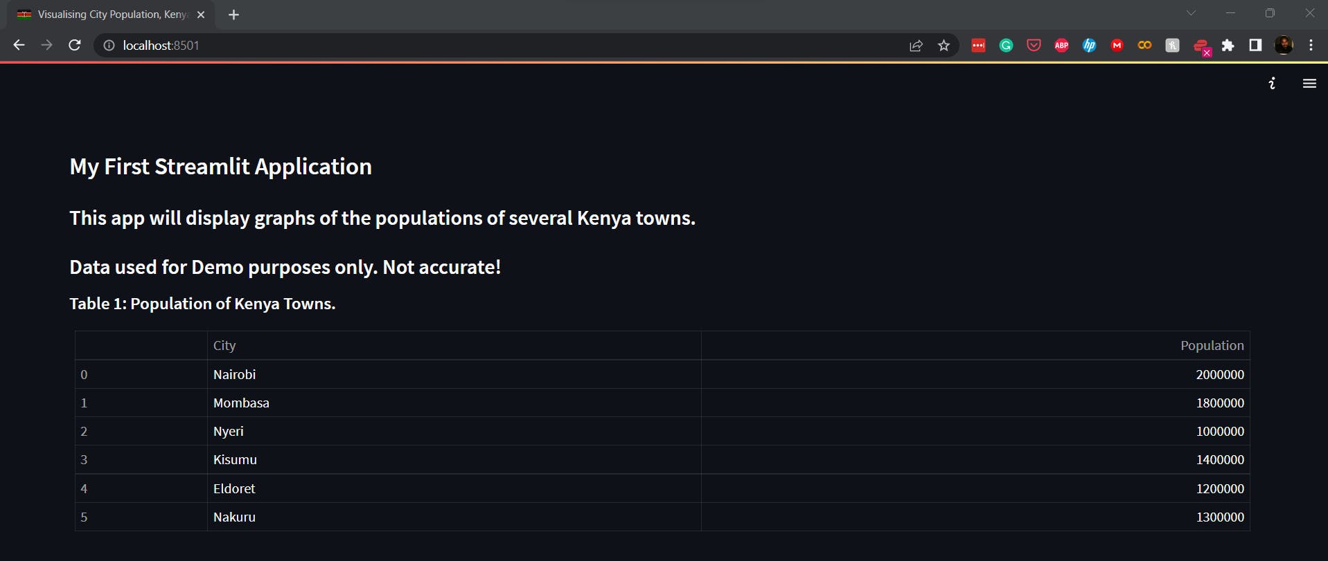
The following code section produces a table on our application using the data frame created above. As seen previously, we shall also make a table title/header using Markdown. The code section and its effect on our app are shown below.
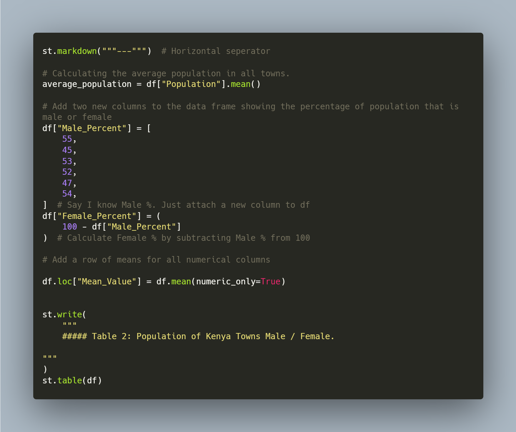
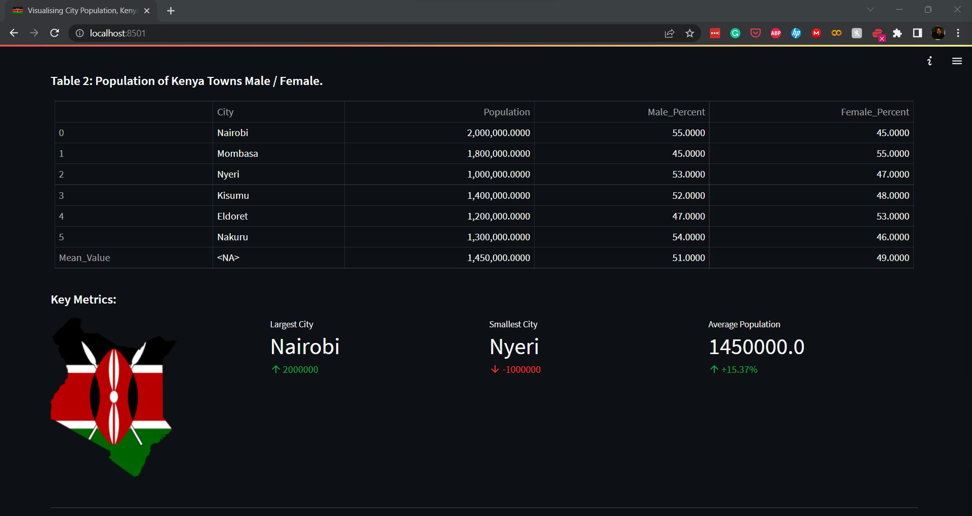
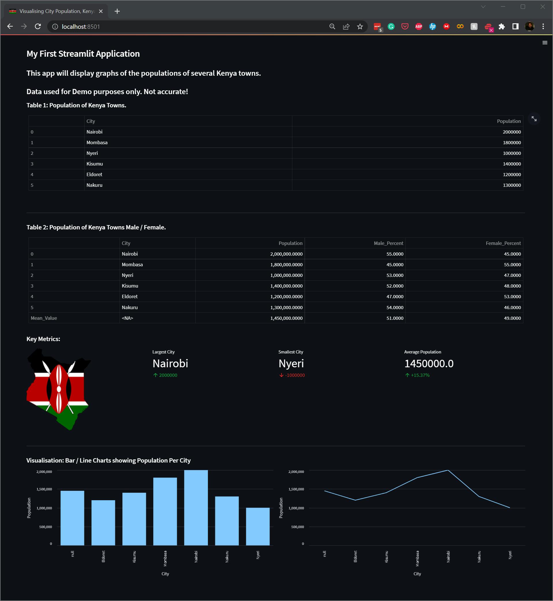
In the next section, I demonstrate how we can analyse the data. It is unimportant if you don't understand Pandas; I will write more about it in the coming days. In the code below, we use Pandas to calculate the mean age of the population and generate two columns with the percentage proportion of the male and female gender in the cities. We also calculate the mean of all the columns and create a new row named "Mean_Value" in our data frame. We then display the new table, adding a new header/title.
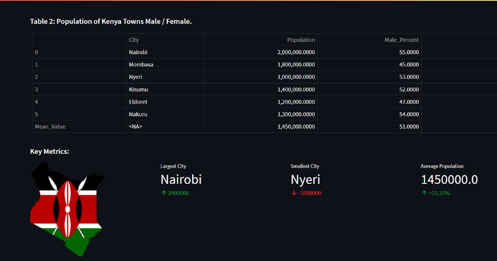
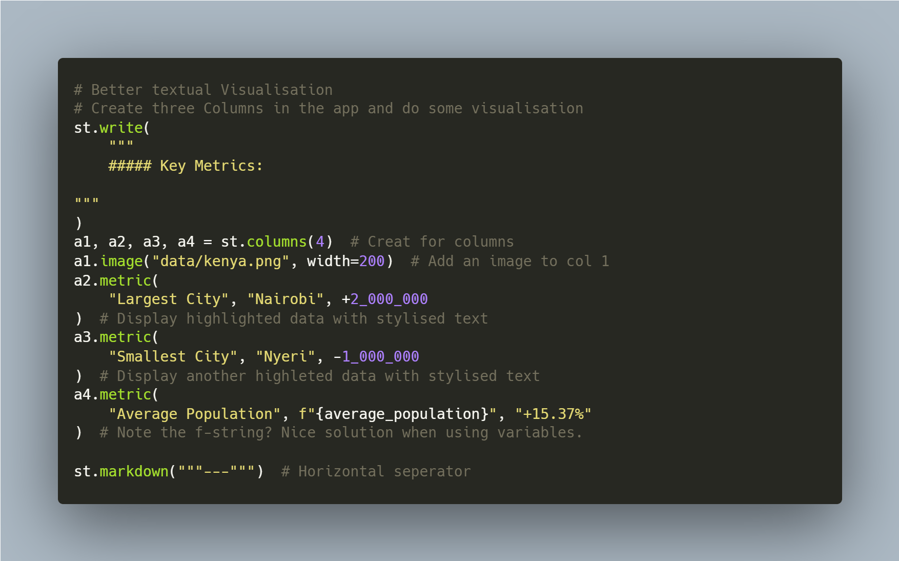
In this section, we can further see how we can fine-tune our application. We first create four columns and then add elements to each of them. The first column has an image, while the rest uses Streamlit's metric functionality to display critical metrics we would like to focus attention on. The code for this section and the result of sections 3 and 4 on our app are shown below:
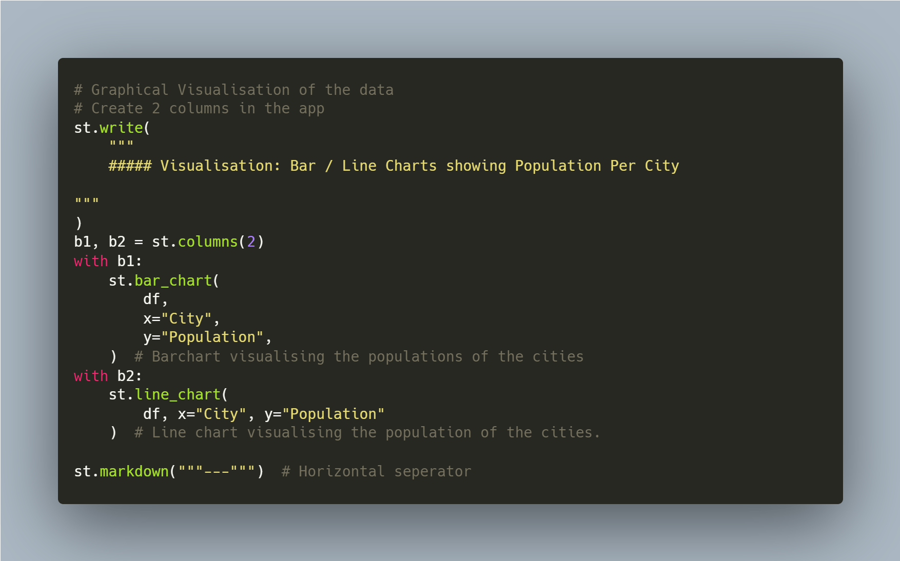
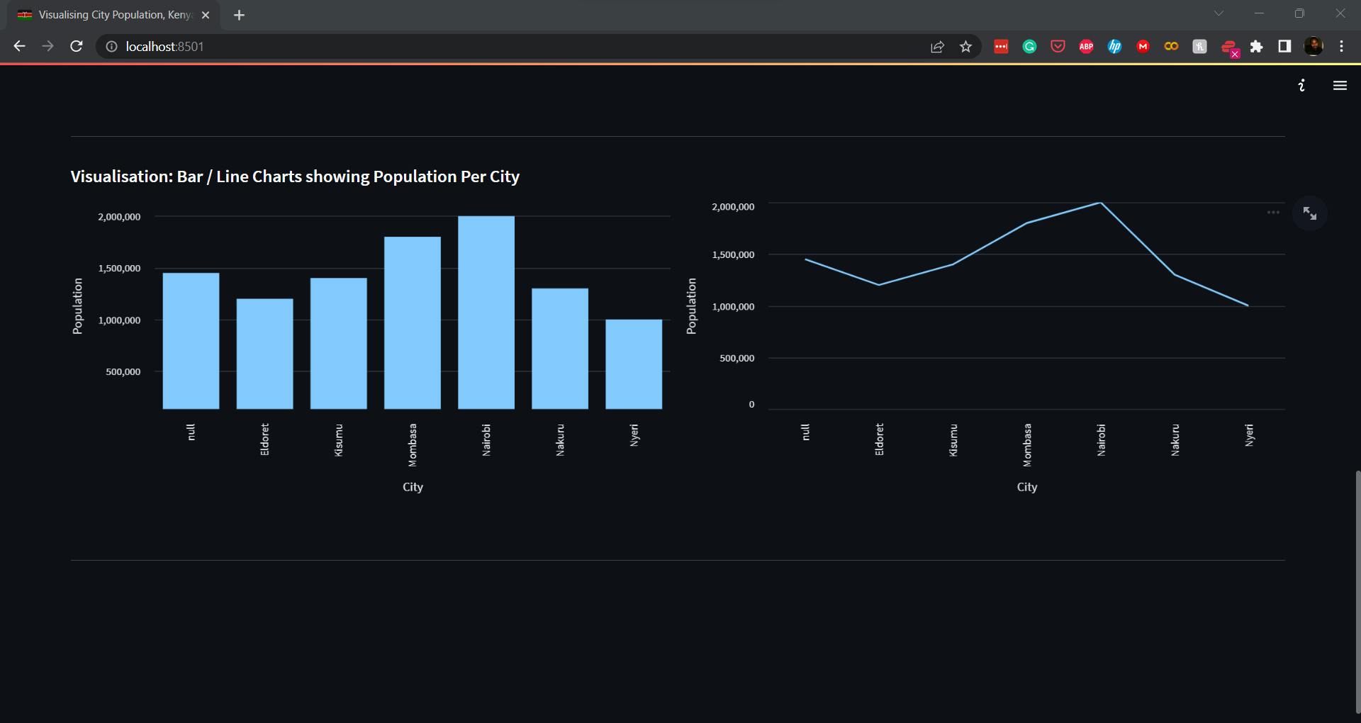
Finally, we can draw graphical visualisations to present information we have gleaned from our data analysis. Streamlit integrates with other Python visualisation libraries, Plotly, Altair, and Matplotlib. In this example, we shall only use the native charts: bar_chart and line_chart. We shall delve into all the more complex libraries in our next blog. In this section, we create two columns and use Streamlit to display two graphs showing the population per city.
Final Code & App
"""
A simple streamlit app demo.
"""

import streamlit as st  # Import the streamlit package to the app.
import pandas as pd  # import the pandas package to handle data.

# Page setting - Set's your application's layout, title and icon.
# "KE" is the shortcode for an emoji of the Kenyan flag
# Check all supported emojis here - https://raw.githubusercontent.com/omnidan/node-emoji/master/lib/emoji.json
st.set_page_config(
    layout="wide", page_title="Visualising City Population, Kenya", page_icon="🇰🇪"
)


# The code below use the inbuilt streamlit "write" functionality and
# Markdown Language to write formated texts on your app.
# You can learn more about Markdown by Googling it.


st.write(
    """
    ### My First Streamlit Application
    #### This app will display graphs of the populations of several Kenya towns.
    #### Data used for Demo purposes only. Not accurate!

"""
)

# In the following code section, we shall create a new pandas data frame, read data to it and
# do some simple analysis.

df = pd.read_csv(
    "data/kenyan_town_populations.csv"
)  # Creates a dataframe df and loads data to it from the csv file.


# The code below creates and dsiplays a table with an heading.
st.write(
    """
    ##### Table 1: Population of Kenya Towns.

"""
)
st.table(df)  # Using streamlit's table functionality to draw a table of our data


st.markdown("""---""")  # Horizontal seperator

# Calculating the average population in all towns.
average_population = df["Population"].mean()

# Add two new columns to the data frame showing the percentage of population that is male or female
df["Male_Percent"] = [
    55,
    45,
    53,
    52,
    47,
    54,
]  # Say I know Male %. Just attach a new column to df
df["Female_Percent"] = (
    100 - df["Male_Percent"]
)  # Calculate Female % by subtracting Male % from 100

# Add a row of means for all numerical columns

df.loc["Mean_Value"] = df.mean(numeric_only=True)


st.write(
    """
    ##### Table 2: Population of Kenya Towns Male / Female.

"""
)
st.table(df)

# Better textual Visualisation
# Create three Columns in the app and do some visualisation
st.write(
    """
    ##### Key Metrics:

"""
)
a1, a2, a3, a4 = st.columns(4)  # Creat for columns
a1.image("data/kenya.png", width=200)  # Add an image to col 1
a2.metric(
    "Largest City", "Nairobi", +2_000_000
)  # Display highlighted data with stylised text
a3.metric(
    "Smallest City", "Nyeri", -1_000_000
)  # Display another highleted data with stylised text
a4.metric(
    "Average Population", f"{average_population}", "+15.37%"
)  # Note the f-string? Nice solution when using variables.

st.markdown("""---""")  # Horizontal seperator

# Graphical Visualisation of the data
# Create 2 columns in the app
st.write(
    """
    ##### Visualisation: Bar / Line Charts showing Population Per City

"""
)
b1, b2 = st.columns(2)
with b1:
    st.bar_chart(
        df,
        x="City",
        y="Population",
    )  # Barchart visualising the populations of the cities
with b2:
    st.line_chart(
        df, x="City", y="Population"
    )  # Line chart visualising the population of the cities.

st.markdown("""---""")  # Horizontal seperator
Resources
Code available on GitHub -> https://github.com/brightmaraba/hashnodeblog_streamlit
Check out the app live ->
https://brightmaraba-hashnodeblog-streamlit-app-27gfh4.streamlit.app/
Conclusions
Easy to Use: Streamlit is designed to be intuitive and easy to use, so developers can quickly build web apps without needing to learn a complex web development framework.
Flexible: Streamlit provides a wide range of features and options to customise the look and feel of the app.
Open Source: Streamlit is open source and free for anyone to use.
Community: Streamlit has a growing community of users and developers who are helping to improve the framework and build new apps.
Fast: Streamlit apps are fast, efficient, and can be deployed quickly.
Secure: Streamlit apps use state-of-the-art security protocols to ensure your data is safe and secure.
Read more on Streamlit.
Coming Up
Part 2 - We shall build a more complex application to analyse data from the Kenyan General Elections.
Part 3 - We shall learn how to deploy the app to the Streamlit Hub.
Follow me and send me your views and suggestions on Python topics I should consider writing about.
Thank you for reading, and until next time, keep coding!
